WABI SABI SUSHI
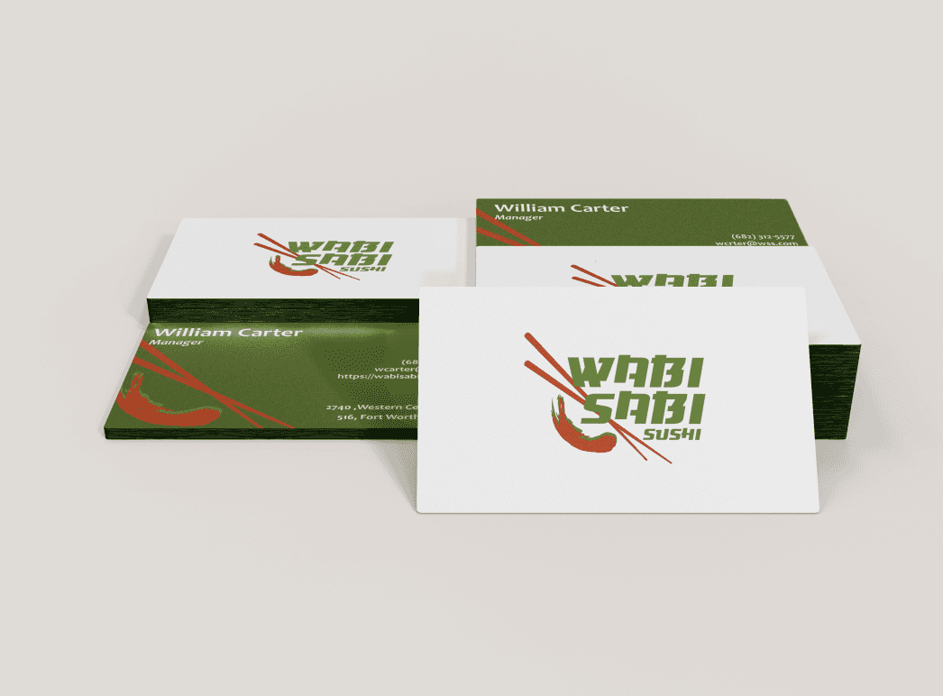
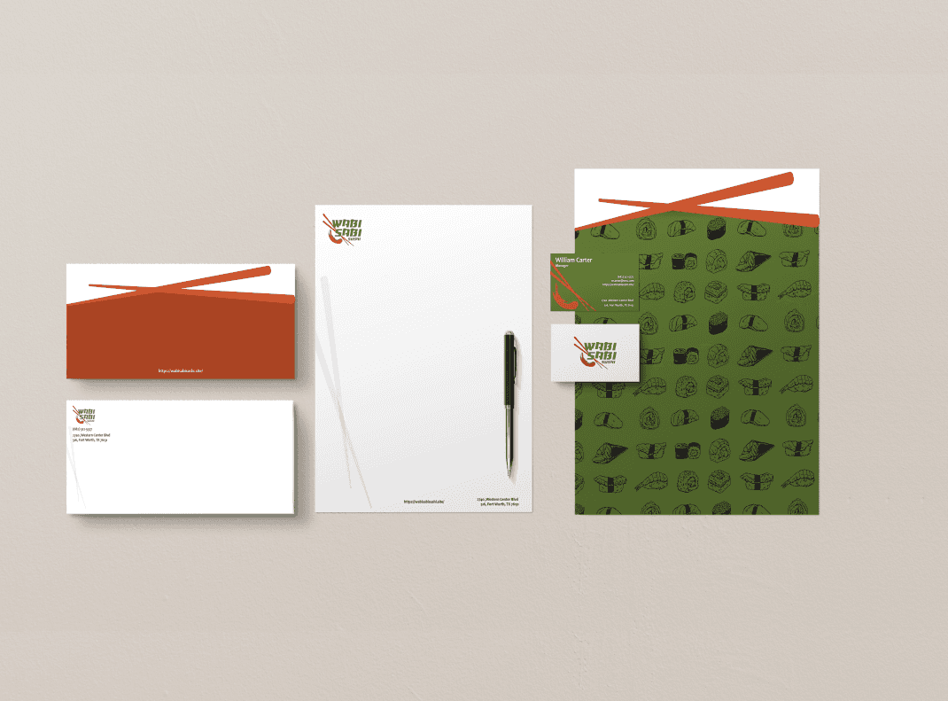
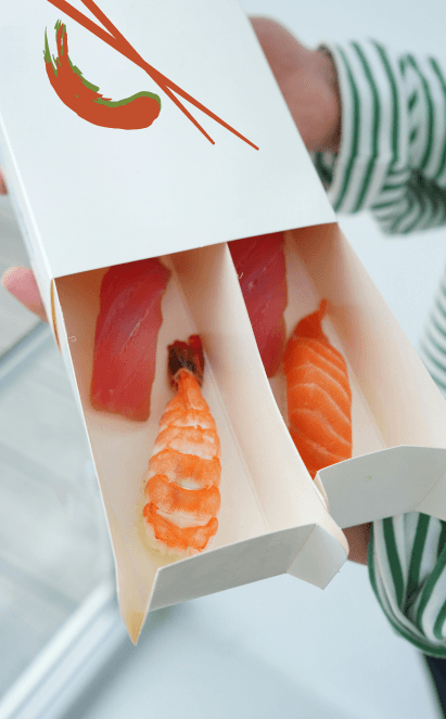
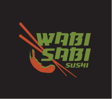
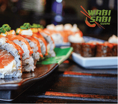
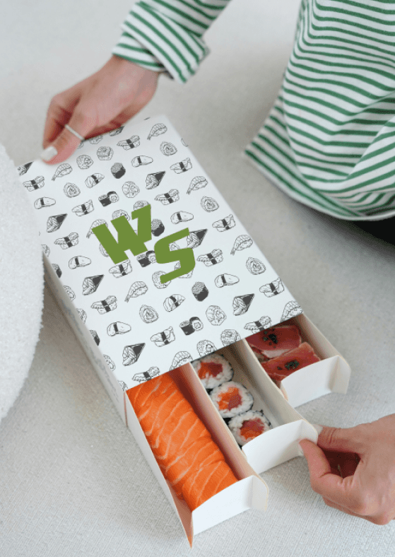
A re-branding of Wabi Sabi Sushi. Focusing on redesigning the logo and stationary set with new branding elements. Wabi Sabi Sushi is known for their decorative plates and food display, playing with sauce swatches on their plates in which they serve their sushi on. The smear element used in the logo is inspired by their presentation of their sushi. Pairing this with vibrant contrasting colors seen from their dishes such as a wasabi green and a salmon orange to
bring out the vibrancy of style in the restaurants personality. Tying it all together with illustrations of chop sticks and sushi paired with a bold stylized font which falls within the style of Japanese inspired type. A complete turn around from their original logo mark of a full circle smear and traditional ink brush stroke text in the center in a light grey color tone.
BRAND IDENTITY
2024


WABI SABI SUHSI
BRAND IDENTITY
2024
A re-branding of Wabi Sabi Sushi. Focusing on redesigning the logo and stationary set with new branding elements. Wabi Sabi Sushi is known for their decorative plates and food display, playing with sauce swatches on their plates in which they serve their sushi on. The smear element used in the logo is inspired by their presentation of their sushi. Pairing this with vibrant contrasting colors seen from their dishes such as a wasabi green and a salmon orange to bring out the vibrancy of style in the restaurant's personality. Tying it all together with illustrations of chop sticks and sushi paired with a bold stylized font which falls within the style of Japanese inspired type. A complete turn around from their original logo mark of a full circle smear and traditional ink brush stroke text in the center in a light grey color tone.