TYPE IN TYPE OUT
TYPE | LAYOUT
2023
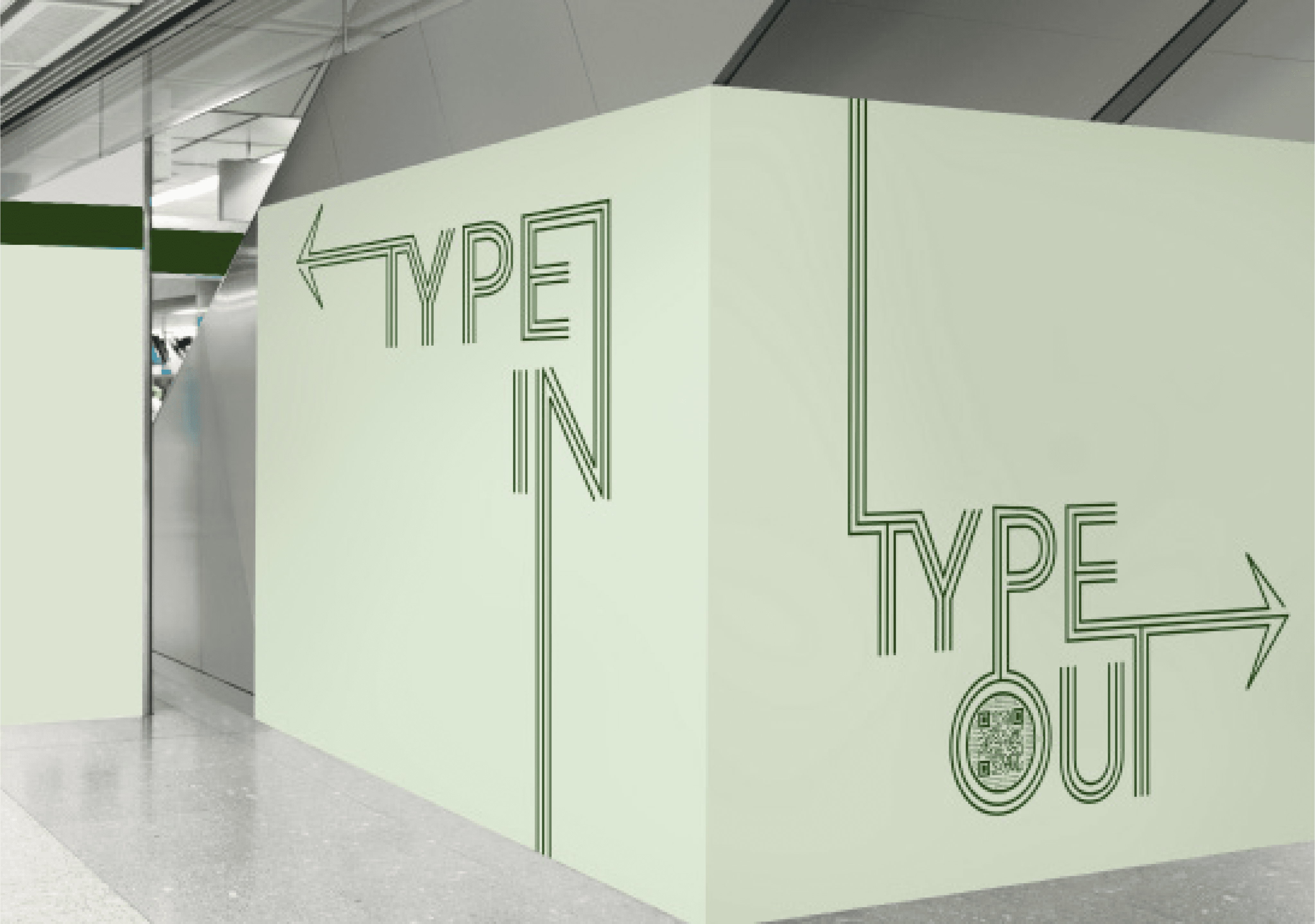
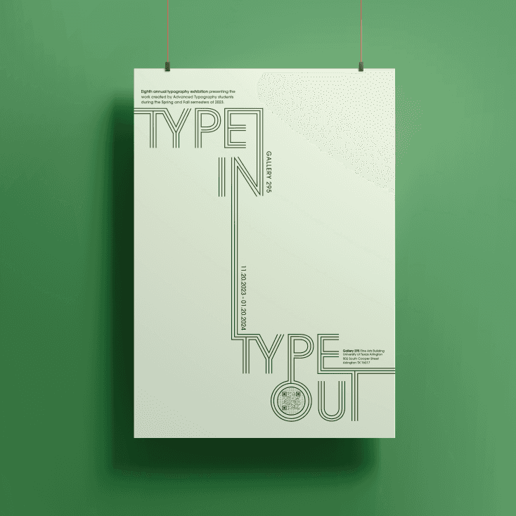
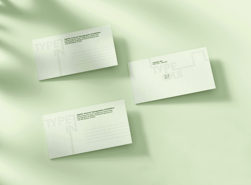
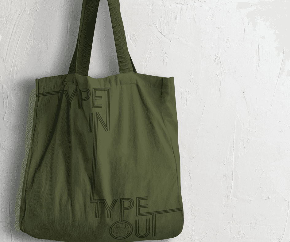
Creating a interactive poster and post cards for The Annual Typography Exhibition at UTA - The University of Texas at Arlington. Thinking of the dark red bricked halls I chose to create a design that will stand out with a green monochromatic theme and a simple line design to engage with the viewer and draw their eye around the poster to the information regarding the exhibition. With the addition of a QR code where they can access
the website of the exhibition to find out more details. Focusing on the art halls most of the flyers and prints posted up are usually busy so in order to make my design stand out I chose to go with a minimalistic route using negative space and light colors to contrast in the space and next to other flyers displayed. Expanding the idea into possible items that may be sold at the exhibition’s gift shop and signage found in the space.
TYPE IN TYPE OUT
Type | Layout
2023


Creating a interactive poster and post cards for The Annual Typography Exhibition at UTA - The University of Texas at Arlington. Thinking of the dark red bricked halls I chose to create a design that will stand out with a green monochromatic theme and a simple line design to engage with the viewer and draw their eye around the poster to the information regarding the exhibition. With the addition of a QR code where they can access the website of the exhibition to find out more details. Focusing on the art halls most of the flyers and prints posted up are usually busy so in order to make my design stand out I chose to go with a minimalistic route using negative space and light colors to contrast in the space and next to other flyers displayed. Expanding the idea into possible items that may be sold at the exhibition’s gift shop and signage found in the space.